Yin Yang Tennis
Brand Identity
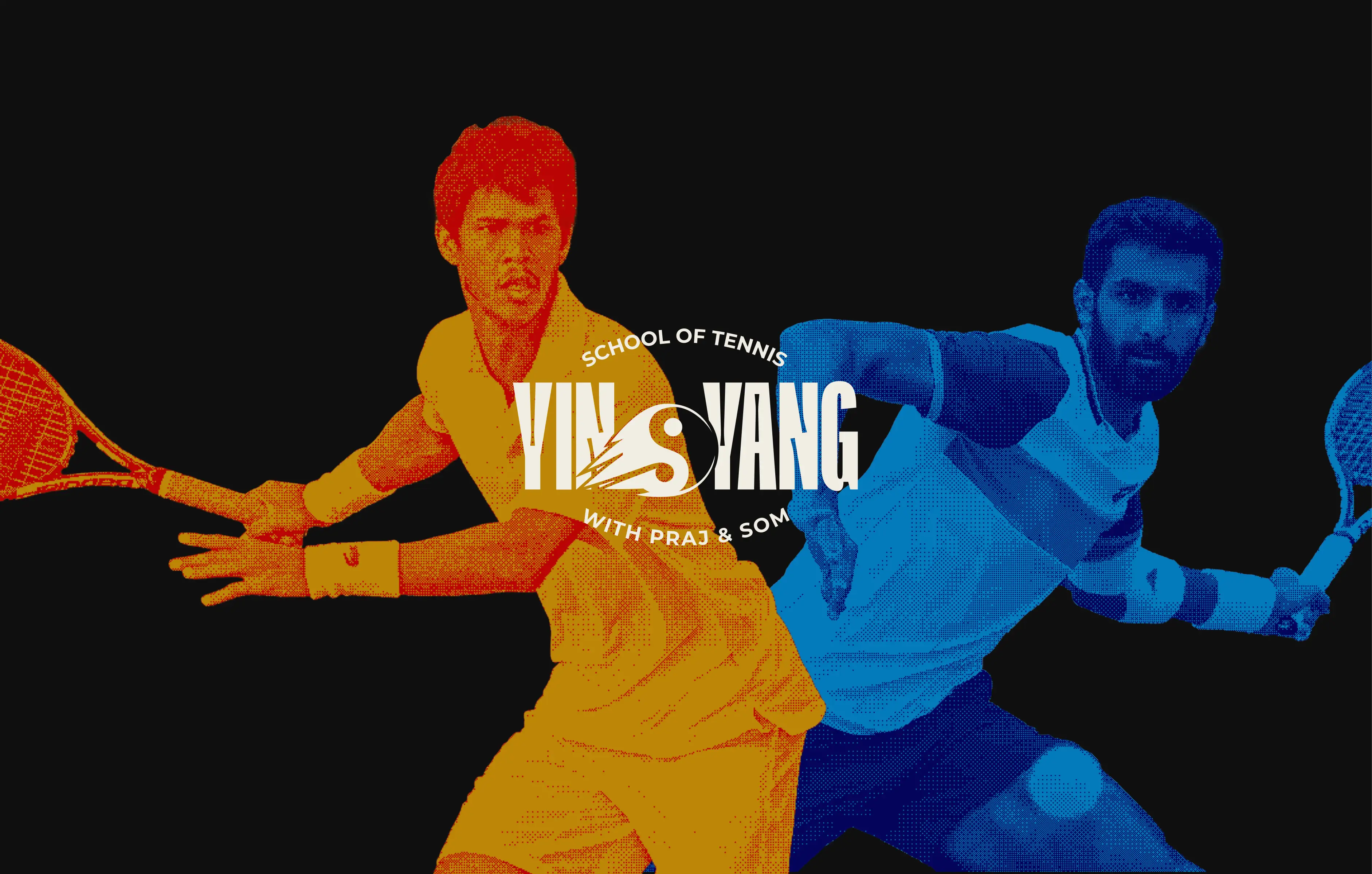
YinYang Tennis is a performance-first tennis school founded by two top-100 ATP pros, with one bold mission—put India on the global tennis map. Built on contrast, grit, and precision, the academy is more than just training grounds—it’s a mindset, a movement, and a launchpad for the next generation of elite Indian athletes.
Role & Contribution
Led the full-scale brand identity design for YinYang Tennis—shaping the core logo system, graphic language, color palette, and typography. Developed brand collateral including merch, event graphics, and social media templates to ensure consistent expression across every touchpoint.
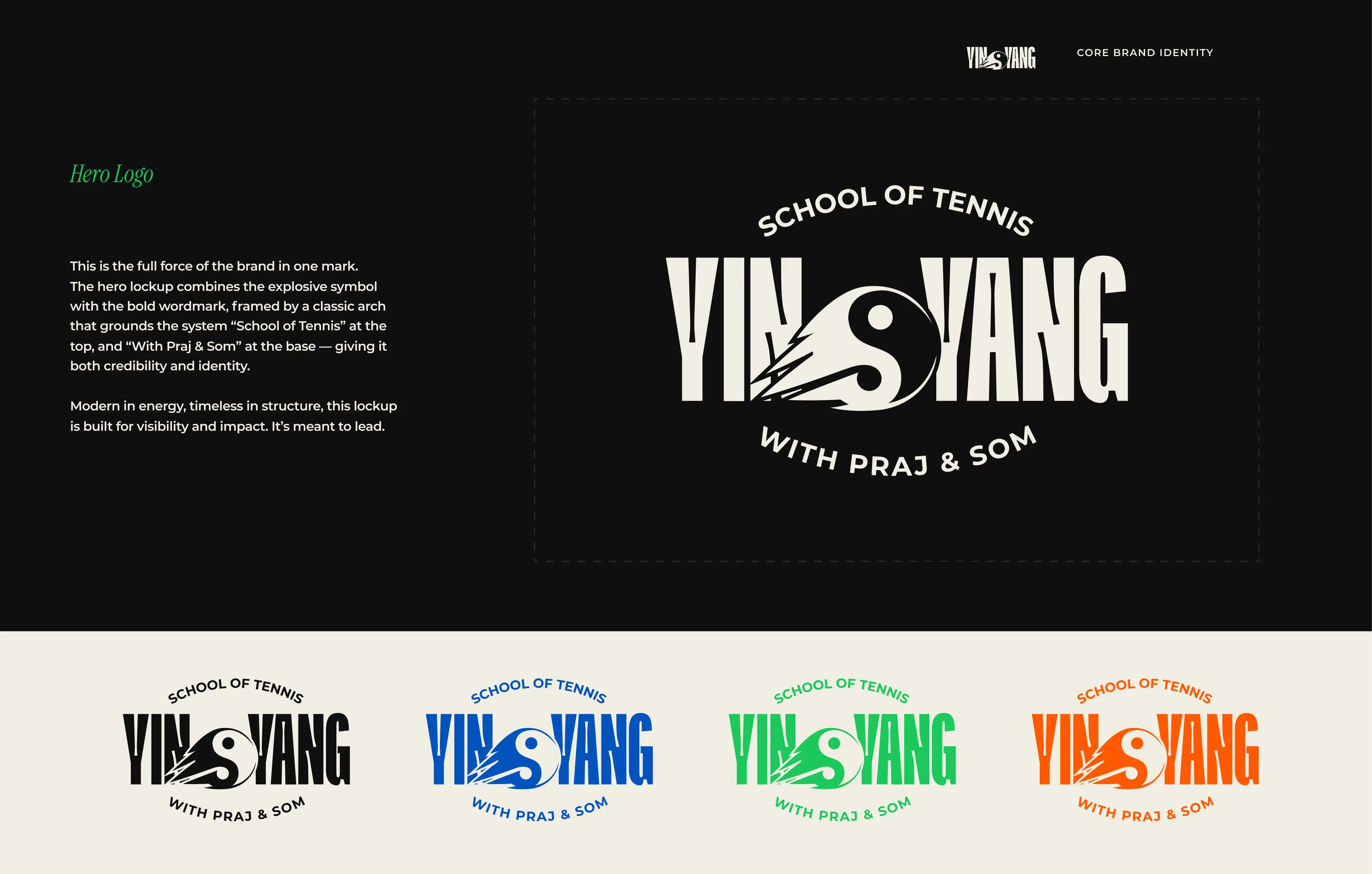
Hero Logo System
The core logo captures the brand’s explosive attitude with balance and structure. A bold wordmark merges with a custom yin-yang motif in motion—symbolizing power, flow, and duality. Framed by an arched lockup and supported by the founders’ names, it’s designed to lead from the front, whether on court signage or digital screens.
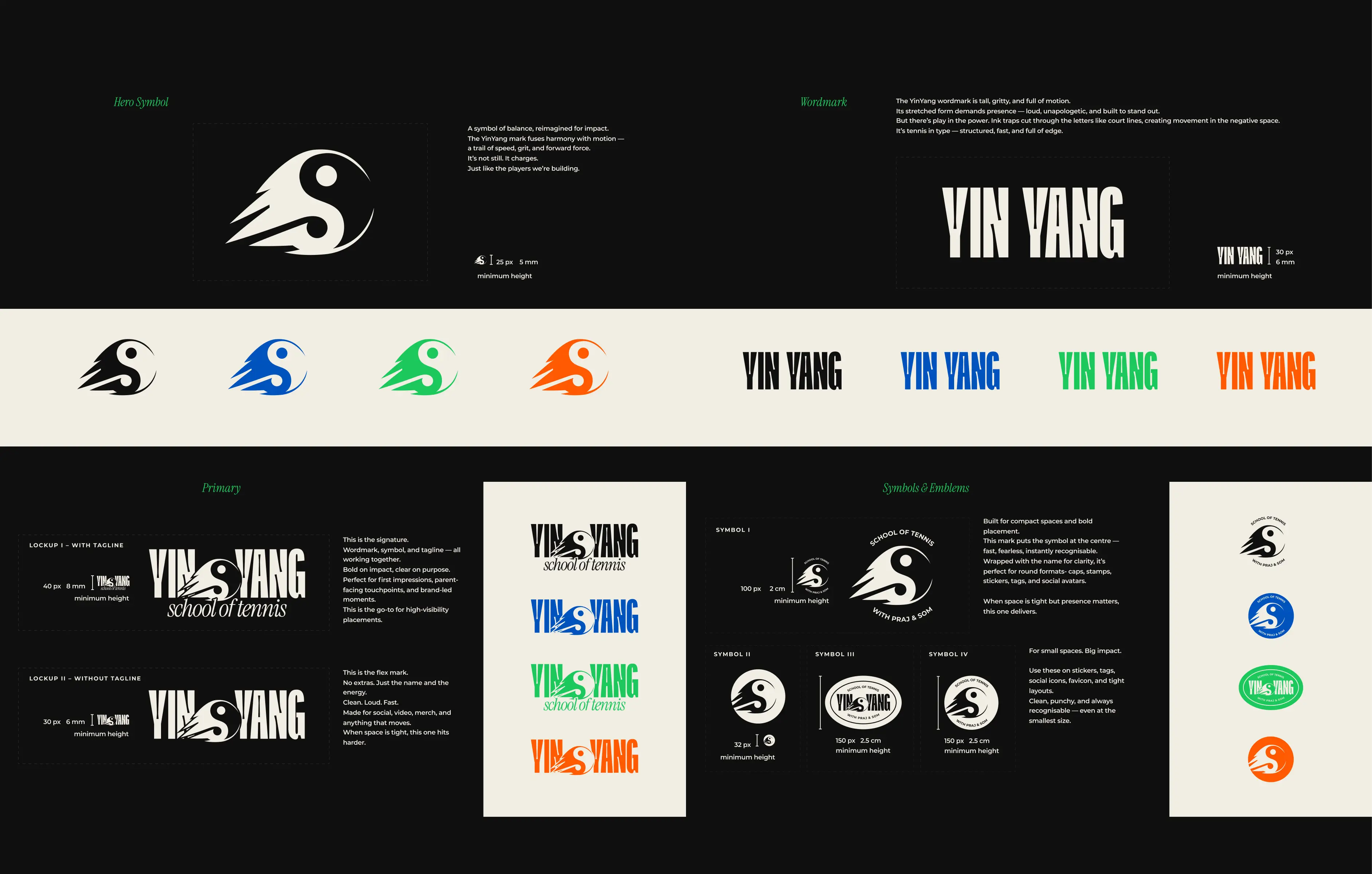
Logo System & Emblems
The brand system includes stacked, circular, and compact lockups for use across sizes and mediums. Whether on performance wear or tiny app icons, every variation is clean, legible, and unmistakably YinYang.
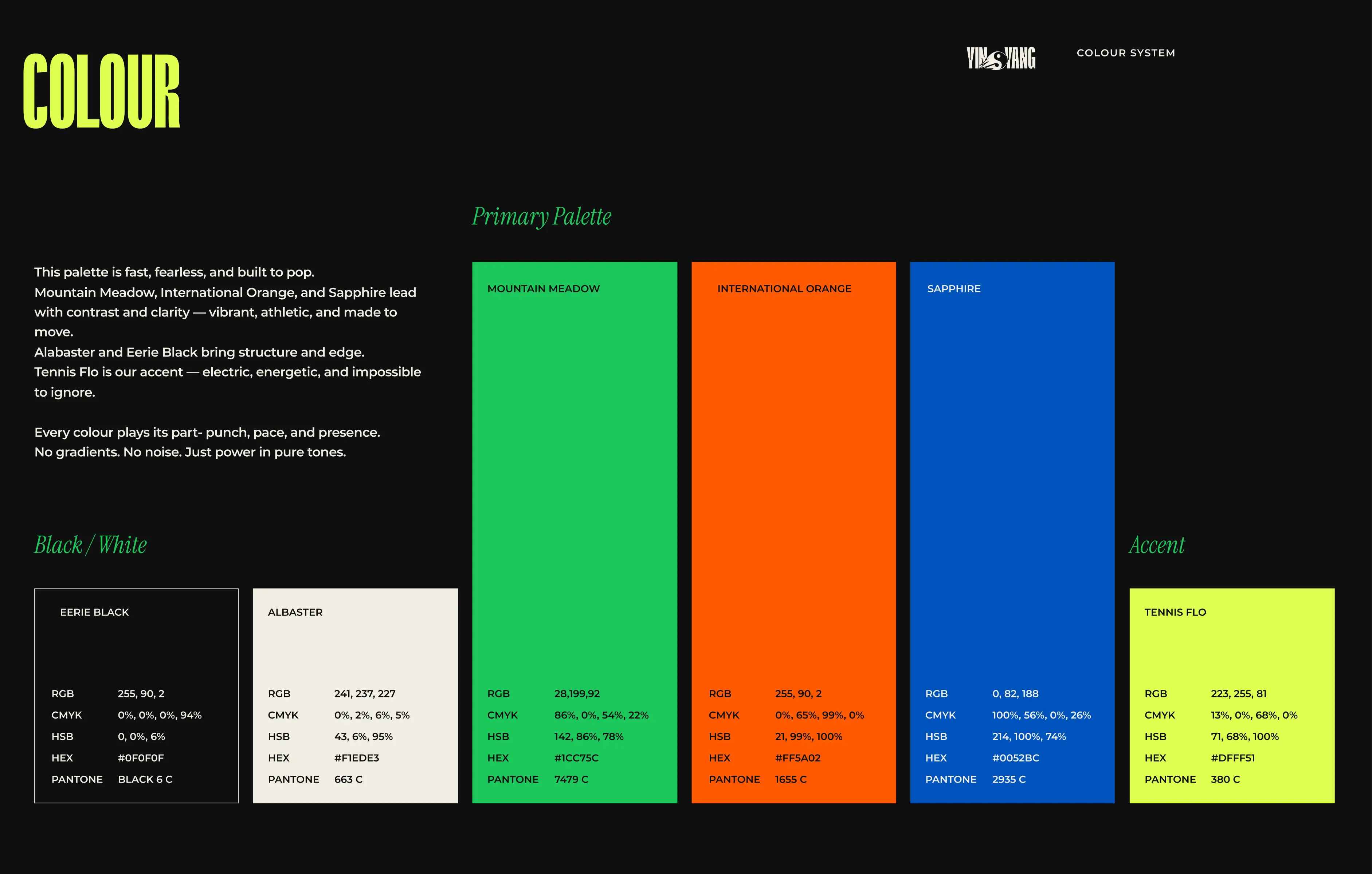
Colour System
No gradients, no hesitation. The palette is vibrant and athletic, built for contrast on and off court. Mountain Meadow, International Orange, and Sapphire drive clarity and impact, while Tennis Flo adds that electric jolt of energy.
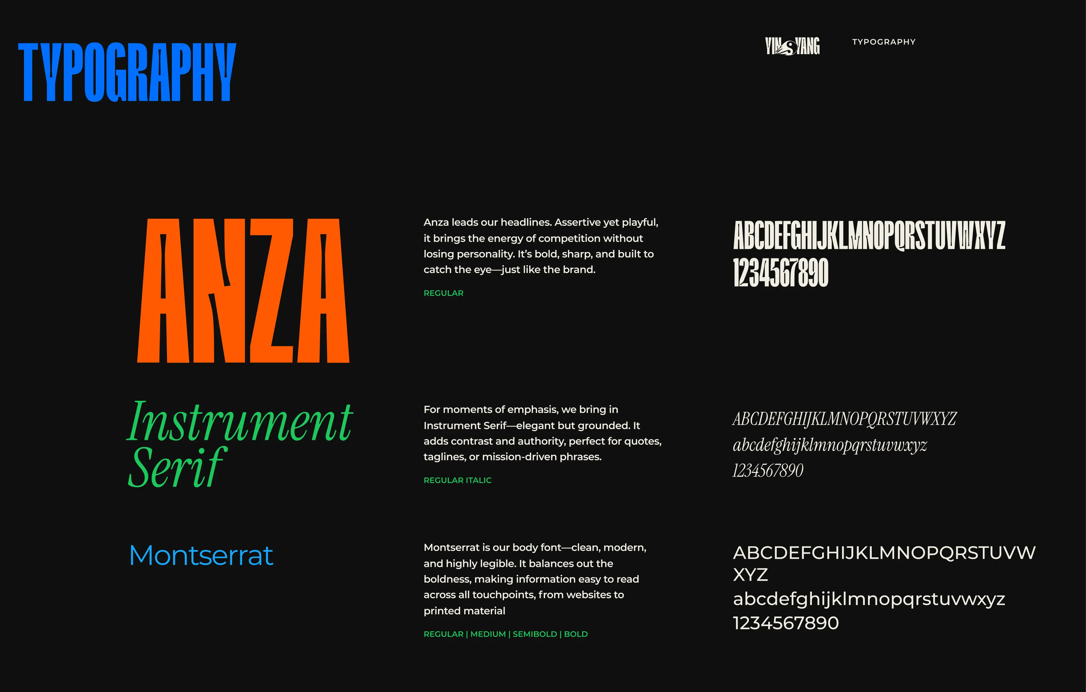
Typography
Anza brings the fight to every headline—bold, angular, and built to turn heads. Instrument Serif adds a refined voice for quotes and details, while Montserrat keeps everything grounded, modern, and easy to read.
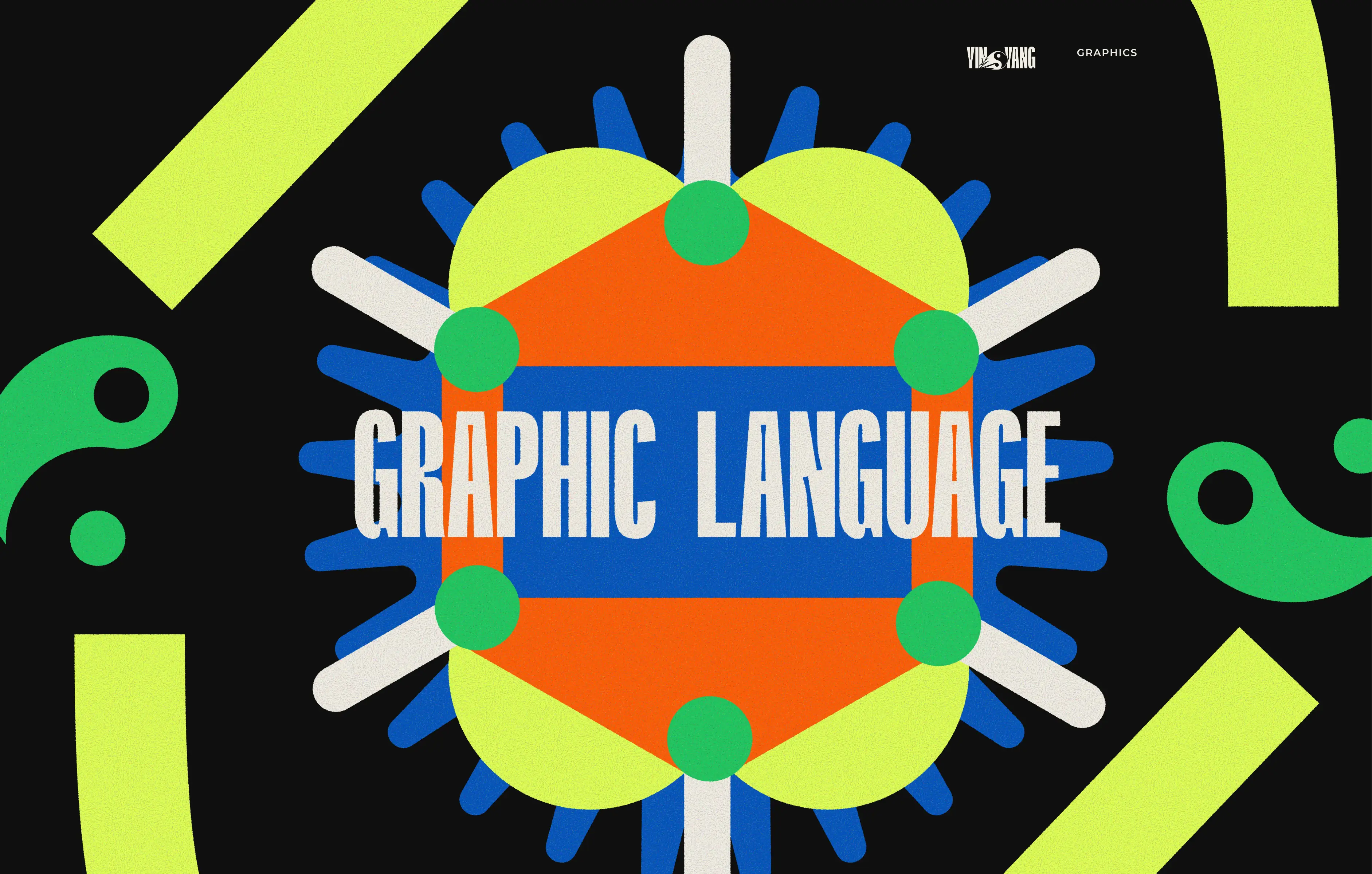
Graphic Language
A high-voltage visual system that mirrors the intensity of the game. Arrows, curves, and bursts animate the brand—designed to move, provoke, and energise.
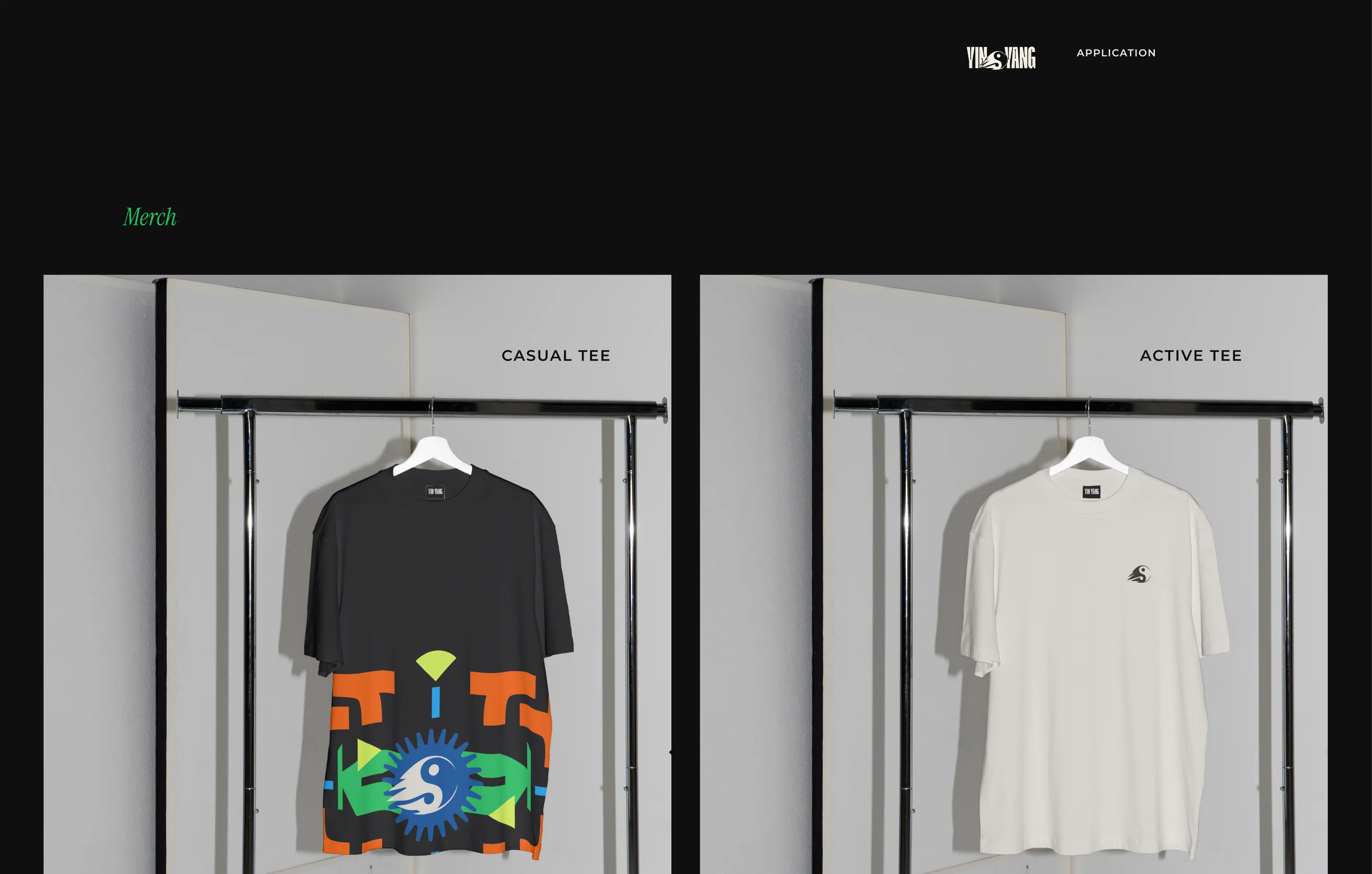
Merch
Two tees, one attitude. The graphic tee is expressive and loud, the active tee sleek and minimal. Together, they carry the brand into both training sessions and everyday life.
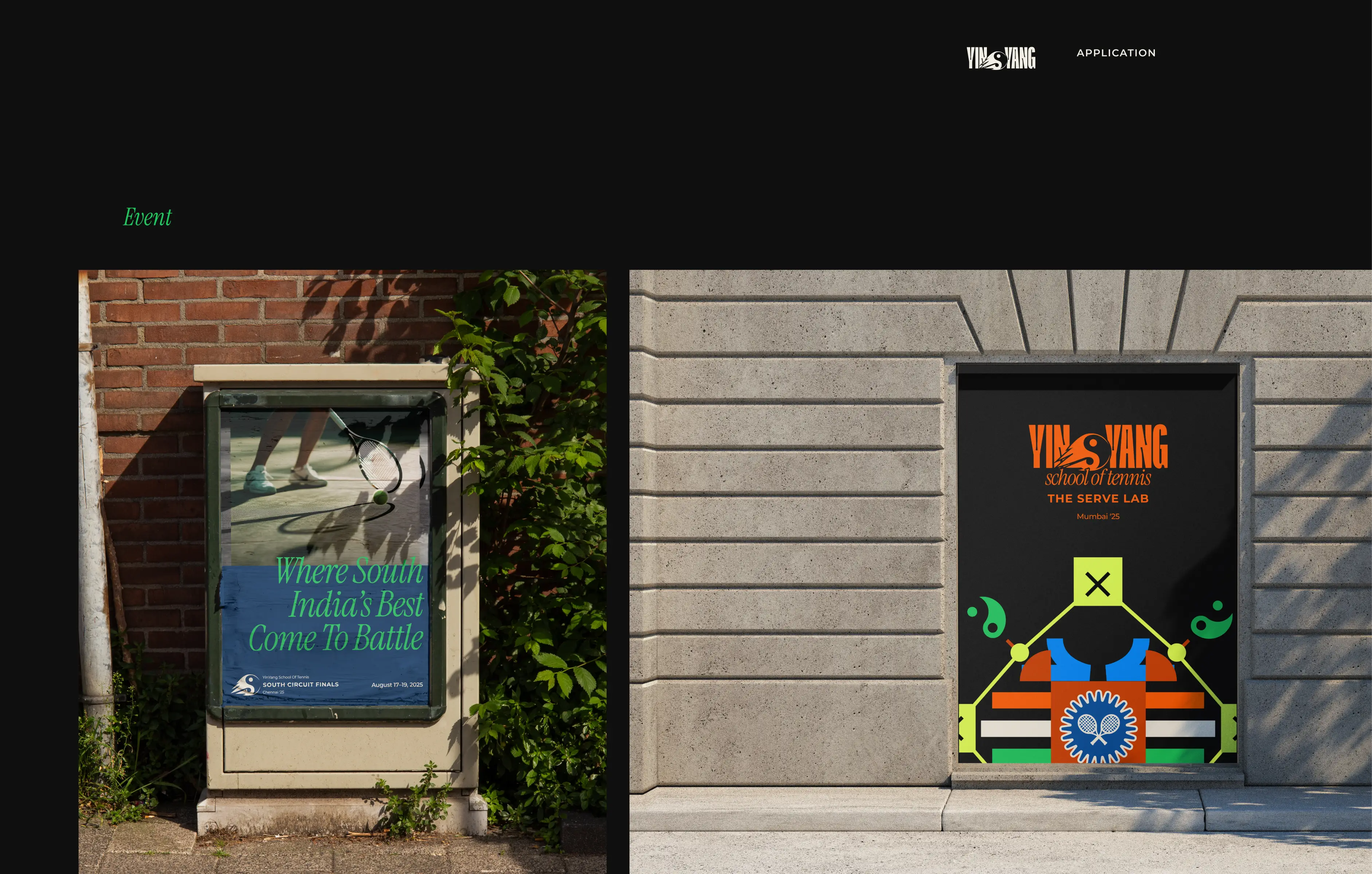
Event Graphics
From street-level banners to venue doors, the brand shows up bold and unapologetic. Custom illustrations and typographic power make sure no one misses what YinYang stands for.
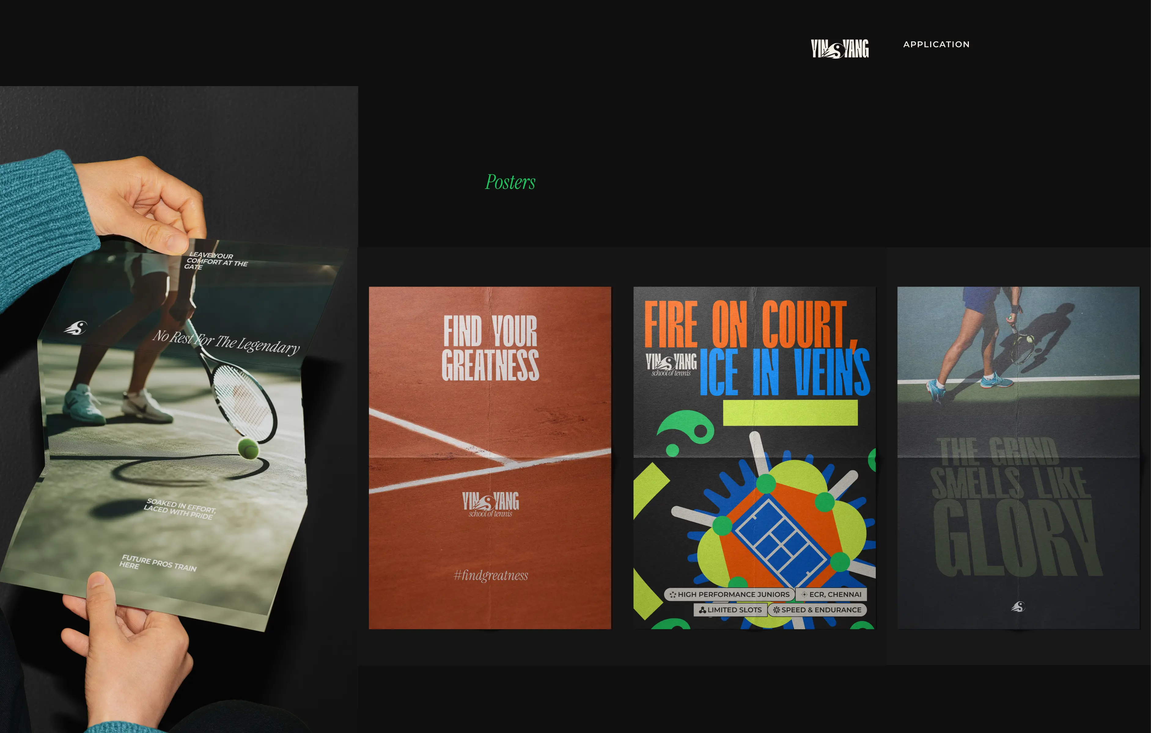
Posters
Raw photography meets grit-packed phrases like “No Rest For The Legendary” and “Fire On Court, Ice In Veins.” Designed to be felt, not just seen.
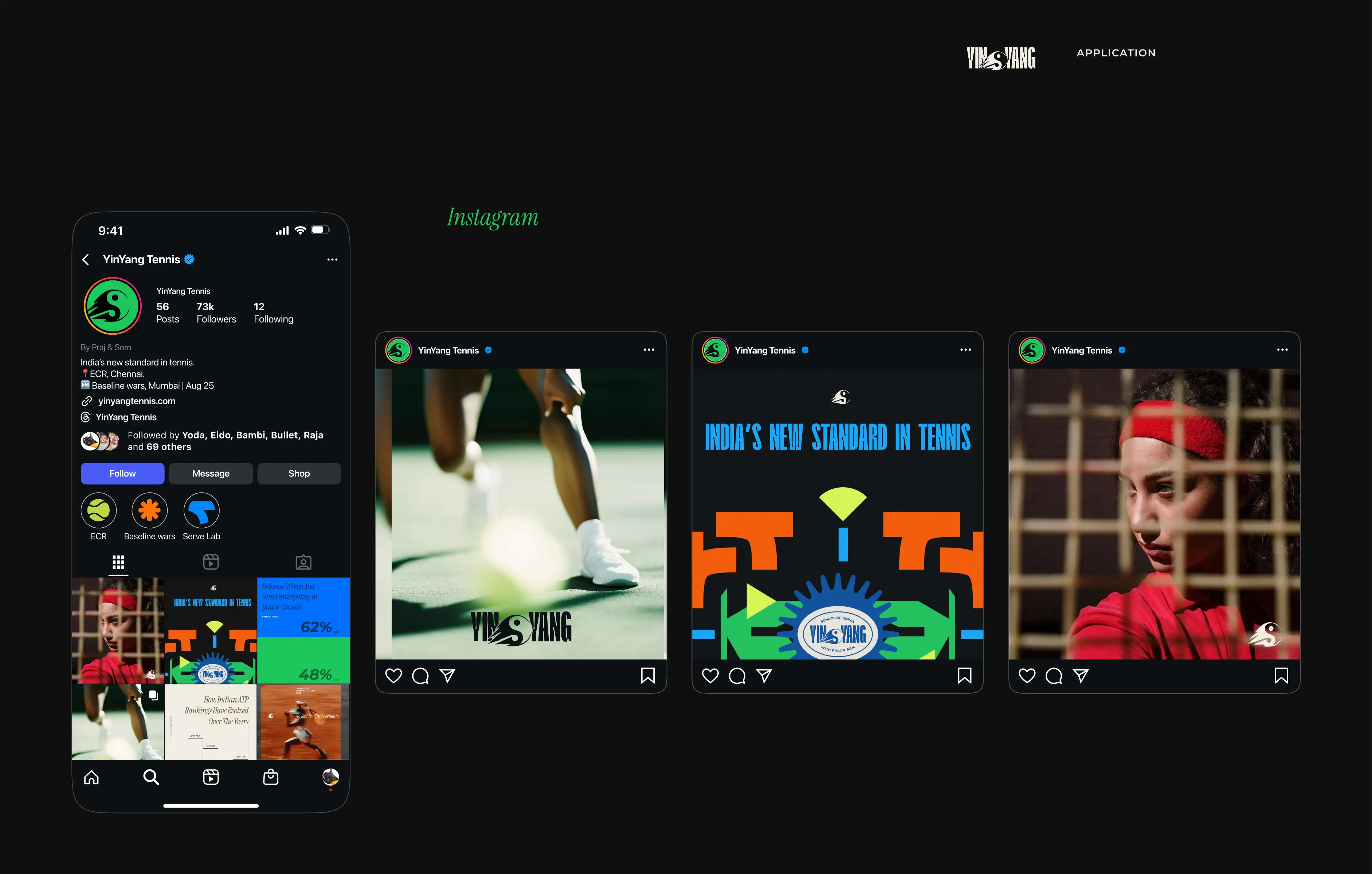
Instagram & Socials
The brand’s voice extends into every reel, post, and story. From drills to drama, the Instagram presence mirrors the tone of the court—high-energy, competitive, and unapologetically bold.
Next Project